With so many new parents in my circle of friends, I thought it would be helpful to round up my favorite nurseries. What do all these inspiration rooms have in common? Fun patterns and colors, furniture that children can grow with, and they don't go over the top with a theme. Skip the theme!
Expecting a little girl? Don't be afraid of pink! Just use it on more grown-up pieces like the chinoiserie-inspired screen featured in this Serena and Lily room or choose an unexpected shade, such as....
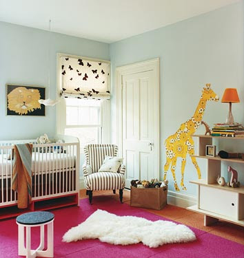
In this example from Domino magazine, pale blue walls are soothing,
while a hot pink rug captures baby's attention at playtime
Hot pink pops up again in this Duc Duc nursery
Want to steer clear of pink and blue? Green is a great option, that's also gender neutral. This Domino nursery is the perfect shade of soft green. Try Perfect Pear (DE5519) from Dunn- Edwards. Also, notice the storage shelf under the crib. This Netto Collection design makes the most of usually under-utilized space. Brilliant!
Is it a crib? Is it a toddler bed? It's both!
This is another smart and stylish solution from the Netto Collection
Here's a fresh color combo from Serena and Lily.
I'm loving that green houndstooth crib sheet!
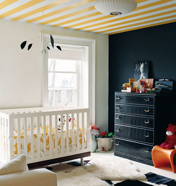
Baby spends a lot of time staring at the ceiling, so paint something inspiring like these yellow stripes. This is another great nursery from the pages of Domino magazine. (Oh, how I miss Domino!)
A beautiful focal wall in this room from Duc Duc offers an unexpected pattern for a nursery and the yellow and white color combo steers clear of being dainty, by adding black to the palette (just as in the Domino nursery with the yellow stripes).
This orange Eames rocker is perfectly placed in
this polka-dotted nursery from Design Sponge
The Apartment delivers a creative space in this nursery. A stencil was used to achieve the border and what makes this room even more fun is that the lower portion of the wall is chalkboard paint!
Here's another creative space from Style Files
that allows the little ones to sprout into artists
Hope this inspiration helps you create the perfect nest for your new addition! Which room was your favorite? Please, leave your comments and I'll pick one room next week, break down the design, and give you resources to pull the look together! (Just like I did with this week's post about the rock 'n roll bachelor pad) Have a great weekend everyone!


3 comments:
I would love to hear how you would make the second nursery! It has always been my favorite.
Maddie
http://www.xoxodecoratewithlove.blogspot.com
Thanks, Maddie! I did a follow up post sourcing all the products in that nursery. Check it out! --
http://blog.gracehilton.com/2009/10/nursery-know-how.html
Hi:
Do you have a source for the border stencil for The Apartment nursery? My wife and I love it!
Thanks.
Post a Comment