Tuesday, June 17, 2008

Musical Eames Chairs Anyone?

In celebration of today's release of the Eames stamps issued by USPS,  I thought I would post a few photos from the Eames Foundation annual member's appreciation day held this past weekend.  We had a tasty lunch and tours of the home given by the Eames' family was a real treat.  However, the highlight of the day was 'adults only' musical Eames chairs!  Thirty plus people battled it out, but only one took home the grand prize:  photograph #82 from the exhibit at the Eames office of 100 photos for Charle's 100th birthday.    
Eames stamps issued by USPS

The Eames House
Case Study #8
1949

A close up of the Mondrian-esque windows.  
The use of gold in place of yellow was a dynamic choice.
     
The Eames' daughter, Lucia

Musical chairs - Down to the last 3 contestants!

Named in honor of his grandparents, Eames, presents the champion with his prize.

Also, check out Vintage Eames, sponsored by the Eames office.  It offers a wealth of information for anyone out there with vintage pieces.

Monday, June 16, 2008

Great Dane!


Design Sponge has done it again!  Blogger, Grace Bonney, has provided a glimpse into the lives of so many fabulous spaces and today, she has posted a 'sneak peak' of Ferm Living founder, Trine Anderson's home. Her Danish digs are filled with beautiful patterns, stunning furniture and great solutions.  Take a trip over to Design Sponge and enjoy!

Sunday, June 15, 2008

Dwell on Design Review

Over 200 exhibitors showcased everything from pre-fab homes to tech toys and handcrafted furniture at this year's Dwell on Design.  Sponsored by Dwell magazine, we wouldn't expect less than smart and stylish products.

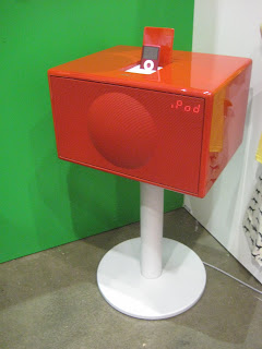
My new favorite site to browse (and buy!) is Huset, which features modern Scandinavian living at it's best.  These tree coat racks, bird wall hooks, and fancy IPod dock are just few of the treats the owner had on display. 

This desk from Fusion actually folds up!  Get the same look as a vintage tanker desk in a portable package that is easy to move with you from apartment to apartment and certainly more practical for a small space than the clunky 60's versions that weighs a ton.


The LAX series from MASH Studios is a perfect combo of  materials.  The solid walnut contrasts well with the powder-coated sliding doors.  Shown here are the 3x wall cabinets, but the style is also available in a coffee table, side table, bed, wall-mounted desk, and TV bench.    

Hand-crafted furniture from Maine from Thos. Moser was stunning and if you have a stark interior, a piece like this could warm things right up.

This retro-chic cabinet from Wilkerson furniture is a nod to the early days of the television.  It's slim cabinet (custom sizing available) will hold a flat panel TV.  This 20th century piece is even 21st century friendly, made from sustainable wood with a non-toxic oil applied by hand.

Environment furniture is another eco-conscious company that has injected some style into green living.


This pre-fab house featured interior design by Vanessa De Vargas of Turquoise.  Most of the furniture, as well as the house, are available from Hom.


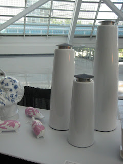
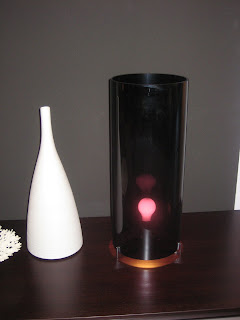
Last, but not least, some of the best stuff of the day was in the gift shop.   I discovered wares from A+R like these fun fruit platters, oil lanterns, and carafes.  And if you need an external hard drive to back up all of your hard work, check out these glossy gems!  

Art Walk Review

The Avenues of Art & Design, with all of its luxurious showrooms on Beverly, Melrose and Robertson, opened its doors for the 11th annual Art and Design Walk.  It is easy to drop a month's salary on a lamp or purchase a sofa that cost as much as a new car in one of these places. However, it's still fun to browse, even if their pricey wares are out of reach for your own home.
My first stop was Kartell, where a DJ was drawing crowds to check out all of their fun products, including these limited edition Dolce & Gabbana leopard print chairs.

B&B Italia was filled with drool-worthy products including this over-scale cane indoor/outdoor chair and papasan.  The Body Raft, designed by David Trubridge for Cappellini, would also be a great poolside lounger.

Grape seemed to be a color that popped up in many of the showrooms, especially for lighting. The first two photos of fixtures from DDC had a nice opacity to the glass.  The effect it had on a regular incandescent bulb cast an eerily beautiful light into the space.  The chandeliers from Cappellini and light bulb silhouette lamp from B&B Italia continue the theme.

DDC also had these chairs which were far from ordinary, but still very elegant.  Epoxy painted aluminum chairs look so lightweight, they almost seem to float.  Available in white or black.
 
Among the expensive kitchens and baths in Bontempi, I spotted this simple way of showcasing artwork or photos.  Binder clips were used with black mat board.  A white pen was used to add captions.
How about this eye-catching LCD TV from Bang and Olufsen?  I generally wouldn't want to call attention to electronics in a space, but I wouldn't mind this candy-apple red beauty stealing the show.

Finally, Modern Living had some fabulous pieces from Jaime Hayon's Showtime collection (inspired by MGM musicals).  The contemporary take on a classic hooded wing chair was my favorite item of the day.  I also wanted to take home the decidedly quirky ceramics, also by Jaime Hayon.  Sadly, I left empty handed.  There's always next year.


Related Posts Plugin for WordPress, Blogger...