Wednesday, February 23, 2011

Fresh Fruit

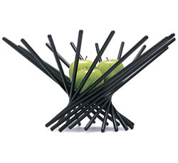
Our neighborhood recently had a produce swap where we shared the bountiful harvests from our backyards. Our family just has one sad little lemon tree, but we showed up anyway and scored tangerines, limes, and grapefruit! Citrus looks so enticing when displayed in a great bowl on the kitchen counter and what could be more cost effective decor? Snag one of these delicious bowls then swing by the market and pick up some colorful produce. You can dress up your kitchen on the cheap and have a healthy snack on hand!


Tuesday, February 22, 2011

Flea Market Fun

This past Sunday was the monthly Long Beach Flea Market.  As you might expect, browsing the aisles and aisles of goodies that need new loving homes is one of my favorite past times. I've been known to squeal with delight when I come across an especially good buy (like this book in an Amish Country antique mall for only $5!) and I'm always left wishing I had a football field-sized storage unit somewhere where I could keep all my furniture finds for potential future use. Alas, my practical side prevails and we ended up going home with just a couple of vintage song books (1937 and 1941) for baby Cordelia.  I'm not a Big Bang Theory viewer, but apparently there's a popular little diddy about a kitty (I swear I didn't even mean for that to rhyme) that first appeared in in one of the books. Anyone know what I'm talking about?


These Raymond Loewy-esque chairs would look great around a small walnut table like this


Beautiful tin tiles that could be hung in a grid as wall art or used under glass for a coffee table


I briefly considered giving these chairs a makeover.  I love the caning detail.
The fabric was actually darker than appears - a beautiful turquoise!


 I've seen a lot of concrete sunscreens in my day, but this was a new pattern for me. 
I'd love to see them worked into a landscape. 


I would have snatched these crocks up instantly, but the $150 price tag wasn't in the budget. Darn!


With a little TLC, I envision this little settee at the foot of a big upholstered bed


Last, but certainly not least, a cute baby photo, Cordelia posing with her new books.

Reader Question: Black Chandelier

I had a question from a reader about the black chandelier from this post. This very popular kitchen that appeared in the August 2006 issue of Domino Magazine has popped up all over the web, but nonetheless she was unable to find a source for the fixture. Good thing I have every issue of Domino ever printed! (I swear, I'm not a hoarder. It's the only magazine that I've kept from the first to last issue. I just enjoyed it that much! For anyone who's not familiar with this now defunct mag, may I suggest this book or this new online magazine.) After flipping through a few back issues and thoroughly enjoying every minute rediscovering some of my favorite rooms, I learned it's the 'Florentine' chandelier from ABC Carpet + Home.  Not sure if it's still available, so I also included another option below.


Friday, February 18, 2011

A Studio

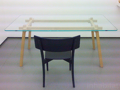
We can all agree that Dwell showcases some pretty cool stuff.  The Joint Table by Tomoko Azumi is no exception. It's base is made possible by a traditional Japanese joinery technique that elevates it to a table worth gracing the pages of Dwell.  (Psst...I'm sure this table costs a pretty penny, but read on for some budget-friendly guidance.)


Image via Inhabitat


Azumi is certainly not new on the scene. These stools from 1965 have become a classic and here are some other designs equally as flawless. (Top - Recharge table, Bottom - Transport lamp)
What if you want to get a similar look for less?  IKEA actually has some products with a similar vibe for your bathroom or bedroom. Try Mandal or Molger. Admittedly not nearly as elegant, but you can't argue with the price, right?

Thursday, February 17, 2011

Refresh, Not Remodel

What would you most love to improve in your home? Most homeowners are likely to answer with the kitchen or bath. These rooms are large investments and updates usually get put off while saving up for a dream remodel. That's why I loved this spread in Real Simple which shows you that you can breathe new life into your kitchen with a little cash and some smart organization. This 1950s kitchen was totally functional. It just needed a little love and a lot less clutter. 


There are some changes that are instantly noticeable like the shiny new range and the addition of a bold striped rug. Look closer and you'll notice some other quick tips to add polish. Aluminum toe-kicks covered peeling wood and a pendant from School House Electric replaced the ceiling fixture. What's one of the biggest (and easiest!) changes to help this kitchen look more pulled together? Loose the refrigerator magnets!  

Here are more detailed shots including one of my favorite features, the original built-in produce drawers: 


Great ideas, huh? Thanks to the folks at Real Simple for refreshing this space and saving some of its 1950s character. If your kitchen functions well overall, skip the major remodel and opt for a quick makeover instead!

Wednesday, February 16, 2011

Rainy Day Rut

In Los Angeles it's hard to complain about the weather. Although, despite our rep, it's not always happy, sunshine days. Today is actually rather rainy and gloomy. So, when I sat down at my desk and my eyes landed on this inspiration that I had clipped from Lucky Magazine a couple of months ago, it was like an instant pick-me-up. 


Wouldn't it be just as satisfying to wake up to such a cheerful room each morning?  This example from Domino Magazine shows you how it's done in a fun, yet sophisticated way.


Is the poppy orange and pale pink color combo that we're seeing in recent fashion mags going to make its way back around to inspire our home decor in the coming months? Do you have a favorite orange and pink room to share? What do you think of this palette - Fresh or failure?

Tuesday, February 15, 2011

Extreme Nesting

Okay, so it's been nearly a year since my last blog post.  I promise I have a very cute excuse....


That's right, a baby girl! About this time last year, I found out I was expecting a new addition to our family. I decided to wrap up the projects that were currently going and settle in to our new house before our little one arrived. By settle in, of course, I mean feverishly turning our entire place upside-down by remodeling every square inch of it. Seriously. I called it "Extreme Nesting", as there was not a day without a project. I was even up at 7am organizing the garage the day I was going to be induced to deliver.

Since that October day that was to be my last before parenthood, I have been getting to know my little girl, Cordelia, and enjoying every minute. I do truly miss design and blogging though. So, I'm diving back in! I have plenty of projects to share from the remodel of our Cliff May Rancho. You really won't believe the 'Before' and 'After'. Plus, I've got great new ideas swirling around in my brain that I think you'll really, really like.  Stay tuned.
Related Posts Plugin for WordPress, Blogger...