Busy, busy day ahead, so I'm going to make this post short and sweet. Although still packed with inspiration! I definitely needed a jolt of color to get me going on my to do list, so I went to my library of images, directly to the master of bright and bold interiors, Jamie Drake and Associates. Just look at those cheerful punches of yellow, orange, blue and red and tell me it doesn't get you motivated. Absolutely gorgeous! Okay, I'm ready to get going on that to-do list now. Everyone have a great Friday and a wonderful weekend.
Friday, January 29, 2010
Thursday, January 28, 2010
Candy from Heartbreakers Design
Simply said, a coffee table needs to be multi-functional. Why have a big hunk of furniture, no matter how beautiful, in the middle of your living room that only acts a landing surface? There's usually a lot of activity around this staple piece of furniture including playing games, serving drinks, channel surfing, working on your laptop, reading magazines...I could go on and on. That's why I love to see smart designs that incorporate storage, seating, even serving pieces like this table from Heartbreakers Design. It goes way beyond its simple title of coffee table to also act as an ottoman and include a serving tray. Plus, that big bottom shelf would be perfect for storing giant art books, magazines or board games. It puts the multi in multi-functional!
Posted by
Sarah Gilbert
at
11:35 AM
Labels:
Coffee Tables,
Furniture,
Ottoman,
Serving Trays,
Steel
New Amenity Home: 20% Off today and tomorrow only!
Ready, set, place your orders! That's right, the new spring collection from Amenity Home has officially launched and all products are available for purchase right here. Okay, that's big news, but it gets even better! Today and tomorrow only, you can save 20% off the new collection. Use FERN20 at checkout. What will you order? The cream + peacock Fern duvet is definitely on my list, but the amber, celery, and grey are equally irresistible. Special thanks to Nicole and Kristina for offering this discount, making the decision easier to well...not decide at all and just order something in each color!
Wednesday, January 27, 2010
Well-Divided
I've finally turned my attention to today's post after spending waaaay too much time playing around with this fun configuration tool from Swedish company, Abstracta. They have a super stylish selection of room dividers and my favorite is the moulded fiber felt Airflake modular system designed by Stefan Borselius. Available in four patterns and five colors, put your imagination to work and configure a solution that goes beyond a simple room divider. The acoustical properties of felt also make it perfect for sound control, so think wall hanging or window covering for noise reduction. I've left the coolest feature for last though. There's a tile that can be used as a ... wait for it... magazine pocket! Stylish, functional, and multi-purpose - Those clever Swedes!
Posted by
Sarah Gilbert
at
12:07 PM
Labels:
Abstracta,
Airflake,
Modular systems,
Room Divider,
Sweden,
Textiles,
Window Treatments
Tuesday, January 26, 2010
One Less Desk + Office
There are many all-in-one office solutions out there, but definitely a gap in the market when it comes to modern, affordable and space-saving options. Heckler Design set out to fill that void with their One Less Series. This flexible station includes four separate pieces, nested together, that allow for multi-tasking while consuming as little space as possible. The hidden shelf also helps you tackle cord management, which is essential in a small space . Keep it tidy, make the most of every square inch and productivity will follow! Available in black, white, silver, yellow and red. File and printer/cpu stand can be purchased separately. Visit Heckler Design for more photos and details.
Monday, January 25, 2010
New Sheet Sets From Anthro
It's so easy to let the bedroom become the least glamorous room in the house. You figure it's the last place people usually see, right? Wrong. Your home should be just as lovely for you as for your guests. So, don't forget to treat yourself to something special for the bedroom now and then, like these gorgeous new sheet sets from Anthropologie. From feathers to 'Fruit Salad' (choose from lemon or limes), these sheets are sure to add some zip to your dull boudoir. Love the patterns, but the set is too pricey? Don't be afraid to mix it up. Buy just the pillowcases and switch out the matching cases that came with your current sheet set or mix with a less expensive set of sheets. Try Dwell Studio for Target. For more tips on creating an inviting bedroom, check out this post.
Posted by
Sarah Gilbert
at
9:57 AM
Labels:
Anthropologie,
Bedding,
Bedroom,
Dwell Studio,
Feathers,
Target
Friday, January 22, 2010
Modern Options from Thos. Moser
Shaker-style meets Danish Modern? It might sound like an unexpected combination, but they actually share a similar approach to design. The Shaker philosophy: "Don't make something unless it is both necessary and useful; but if it is both necessary and useful, don't hesitate to make it beautiful."The new Meridian collection by David Moser for Thos. Moser accomplishes just that, with clean lines and graceful curves that blend in the Danish Modern aesthetic. Each one of these handcrafted pieces is already signed and dated by the craftsman who builds it, but for the first 25 orders of each piece in the Meridian collection, David Moser will include his signature. Each piece is guaranteed for life of the original owner too. Value, simplicity, and beauty. What else could you ask for?
Also, new from Thos. Moser is the Edo platform bed. Described as "minimalist to the core", this piece from the Edo collection is a nice departure from the company's more traditional collections, while still maintaining their core values. Each and every piece is handcrafted at their Maine workshop and don't forget about that guarantee for life.
New Amenity Home Collection
I few weeks ago I stopped into the Amenity studio in downtown LA to meet Nicole and Kristina. I got a sneak peek of what was to come - beautiful new textiles with gorgeous colors and vibrant patterns - but I had to keep my lips zipped and couldn't take photos to share. Until now! Drumroll, please. The first press image has been released and you can sign up for the newsletter so you can get your mitts on this new collection as soon as possible. They'll ship right from their studio to your home! Just look for the newsletter sign-up in the bottom left corner of their homepage. Oh, and the newsletter will also keep you in the loop when they put things on sale. Bonus!
Thursday, January 21, 2010
Kitchens From Down Under
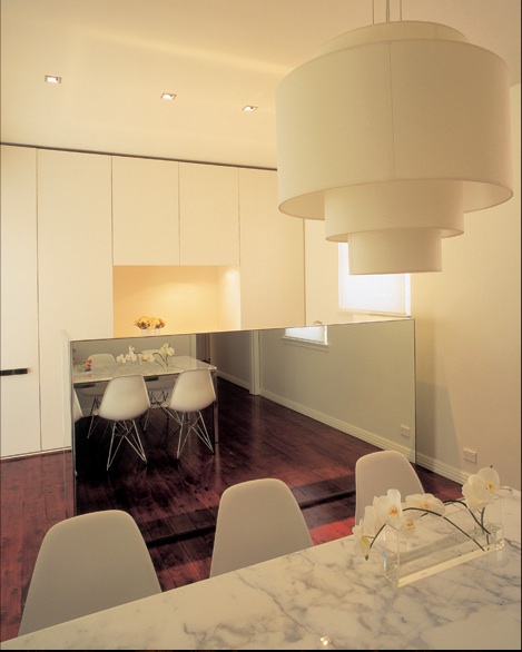
As one of the go to designers in Australia, Greg Natale certainly has an impressive portfolio and he knows how to create a kitchen worth swooning over. In a few of his projects, however, he uses mirrored cabinets for kitchens and I'm just not sure how I feel about it. Don't get me wrong, I love the look, the way it bounces light around the room and adds a touch of glamour to an otherwise utilitarian space. From a purely functional standpoint though, I would personally hesitate in recommending this to a client. Maybe for someone who doesn't cook much and has a maid on standby to clean the mirror weekly, but it just seems like a lot of upkeep to me. Thoughts? Would you put mirrored cabinets in your kitchen? Does style trump practicality here?
Wednesday, January 20, 2010
Color (R)evolution
What is it about a fresh box of Crayola crayons that, even as adults, enlivens our creativity? Perhaps it's nostalgic, as we recall those carefree days spent creating masterworks as a child? Our parents would praise us and exclaim that we were sure to be the next Picasso. Our creativity was not stifled by any expectations or fear of criticism. Given a box of crayons, we'd pour our little hearts out on a blank sheet of paper! And ahhh, the color explosion as you opened a box and paused to make your selection. What a sight!
As you can see from the chart below, that selection has expanded quite a bit from the original eight Crayola colors back in 1908. With the introduction of fluorescents, like Hot Magenta, the box expanded to 72 colors by 1975! Nowadays, kids have a dazzling 120 options including the four newest colors, Inch Worm, Jazzberry Jam, Mango Tango, and Wild Blue Yonder. (The names have gotten quite creative as the years have passed!) With so many choices, a box of Crayola crayons not only inspires budding artists, but also fine tunes their decision-making skills. As adults, the type of decisions we must make get a bit tougher, but if you want to relish the days when our worlds were quite a bit simpler. Well, just pick up a box of Crayolas and break out a blank sheet of paper.
For a full color chronology, visit the official Crayola site
Graphic courtesy of Weather Sealed
Tuesday, January 19, 2010
Top O' Topanga
The L.A. Conservancy Modern Committee is holding their monthly general meeting tonight at Top O' Topanga Clubhouse in Topanga Canyon. Come for the meet and greet at 6:30 to admire the sweeping views of the valley and city lights. Then, stay for all the latest details on endangered buildings in L.A. County. Find out how you can help save them from being completely demolished or remodeled beyond recognition! Just a few of the items on the agenda are the Marina-style Safeway grocery stores (now Vons - yes, that includes the one on PCH that most of you have likely admired while driving through the Palisades), the Home Savings Buildings murals by Millard Sheets, and the Julius Shulman Residence, a home by Raphael Soriano that just recently hit the market. Hope you can join us!
Oh, and don't forget to vote for your top ten 1960s churches in celebration of the Sixties Turn Fifty!
Photo via ModCom.org
Posted by
Sarah Gilbert
at
9:19 AM
Labels:
Julius Shulman,
ModCom,
Preservation,
Raphael Soriano
Monday, January 18, 2010
Twig Table To Recording Studio
This twig cube and various reinterpretations of it have been circulating for awhile now, but take this concept, amplify it and voila - you have a very interesting log cabin! This unique structure, located in the Netherlands, appears to be just a pile of logs when the windows are closed. However, when you step inside and open them up, awaiting you is a light and bright space that serves as a recording studio for music-entertainer Hans Liberg. Piet Hein Eek dreamed up this daring design and it is truly one of a kind. Skip the twig side table and opt for one of these in your backyard!
Image via Remodelista
Friday, January 15, 2010
Modern Hideaway in the Desert
So many great places to stay in Palm Springs and sadly, just not enough free weekends to experience them all! As I mentioned, I'm staying at the Ace Hotel for my upcoming trip during Modernism Week. Had I known that the Modern Hideaway was still available, however, I just may have changed my plans. This three bedroom/ two bath post-and-beam house in the heart of Palm Springs is fantastic! With sunlight streaming in the floor-to-ceiling windows, sleek furnishings atop terrazzo floors, and mid-century modern decorative touches throughout, this place is ideal for a weekend getaway where you're seeking stylish accommodations and total privacy. Oh, and of course, no Palm Springs escape would be complete without a huge saline swimming pool with built-in tanning shelf! For reservations, visit Modern Hideway.
Subscribe to:
Posts (Atom)