Monday, August 31, 2009

Czech It Out

Ever so often, I have one of the those "I'm so lucky to live in L.A." moments. The most recent one happened this past weekend in Venice. While exploring Abbott Kinney on Saturday, after a scrumptious lunch at 3 Square Bakery, I stopped by one of my favorite shops, A+R. While there are always many items to ooh and ahh over, I zoned right in on Daniel Pirsc, a ceramic artist from the Czech Republic that I am now head over heels for and I learned that A+R is the exclusive North American dealer.

Stash your cash in this pretty skull bank

A delicate egg seems a bit more intimidating when nestled in this spiky egg cup

The egg cup featured here with other Pirsc items in an A+R vignette

The Zeppelin salt and pepper shakers add a playful touch to the dinner table

The Zeppelin salt and pepper shown here with the Torpedo wine cork at A+R

Usually stormy weather puts me in a lousy mood, but these raindrops just make me smile and prove that Daniel's art goes beyond the tabletop. These ceramic raindrops are one of seven 3D wallpaper options. Choose from roses, birds, even airplanes!


For more about Pirsc and his creative process, including an in depth look into the casting and firing of each piece of his art, visit his website. If you've seen all you need to and just can't wait to get your hands on his work, then head on over to A+R. Thanks for 'Czech'-ing out my latest discovery!


Tuesday, August 11, 2009

Handmade

I'm thrilled to currently be working with the talented duo of John McDonald and Ivan Sokolov from Handmade, a custom furniture and cabinetry company right here in Los Angeles. There's not a single element of this project that's not customized for the space, so they have their work cut out for them, but it's going to be totally stunning when it's finished! Stay tuned for photos on the results. In the mean time, check out these other examples of their work:

I took the photo above and it was featured in my recap of CA Boom 2008. There are many great features showcased here, from the upper sliding doors to the cookbook niches.

The following photos are all from Handmade's website:


Monday, August 10, 2009

New From De La Espada

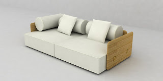
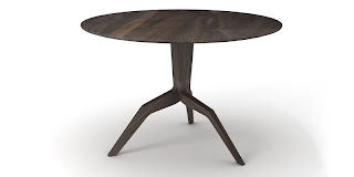
Feast your eyes on the latest collection from De La Espada, including pieces from Matthew Hilton, Leif.designpark, Autoban, and Studioilse. It will make its debut in September at the London Design Festival, but here is a sneak peek.

The Nest Chair from Autoban

Bookshelf by Autoban

Table by Autoban

Sofa by Autoban
Brando sofa by Matthew Hilton

Mars table by Matthew Hilton


Seating collective by Studioilse

Sofa by Leif.designpark
Tone cabinet by Leif.designpark

Friday, August 7, 2009

Country Living With A Twist

Now, this is my kind of country living! Jonathan Adler's reinterpretation of a country home, created for maternity wear designer, Liz Lange didn't "opt for the beige haze of graciousness" as he calls it in his interview with Mimi Read for House Beautiful. Instead he used a foundation of black and white with brilliant pops of vibrant color throughout this playful home.


I'm a big fan of zig zag patterns because of the instant drama it brings to a space, and it's not nearly as predictable as stripes.


This entry hall is so inviting that although this is just a weekend house, as soon as I stepped inside the front door, I would immediately phone the office and say I would be on vacation for at least the next week.


A unexpected pop of yellow appears in the dining room with these chippendale chairs around a classic Warren Platner table.


For the kitchen, Adler says they "used IKEA cabinets because 'why not?' They're well enough made" and he calls IKEA "a treasure. You can get a kitchen that looks fabulous," he says, "and not spend squillions." He topped the budget-friendly cabinetry with marble, a classic and luxurious choice.


I love that Adler throws so many classic mid-20th century pieces into his designs. Here, a Saarinen tulip table is surrounded by Norman Cherner chairs covered in a whimsical vine print.


Pour a drink and relax in this groovy suspended lounge chair.


All the sunlight streaming into this home amplifies all the colors.


Four poster beds are great for large bedrooms, because it essentially creates a room within a room, resulting in a more intimate space. Want to create this look for your bedroom? Use Adler's trick of buying Restoration Hardware curtain rods, attach them to the ceiling and add some grommet-style curtains. Ta-da!


I can't imagine a more welcoming weekend home for Liz and her family. Adler showcases his genius once again with his ability to merge classic and quirky with a functional, harmonious space. Although most of us don't have a getaway like this to escape to, I hope everyone has a great weekend! Happy Friday!

Thursday, August 6, 2009

Feeling Blue

A certain shade of powdery blue keeps catching my eye lately while browsing through my inspiration files. Maybe it's the hot weather and the color seems so cool and inviting, like a refreshing sip of water or a sparkling swimming pool.

One of my all-time favorite sneak peeks on Design Sponge is the home of Jill Roberson from The Office. The minimalist design with its white wainscoting and hint of blue give the room a dreamy quality, as if you're floating in the clouds. The punch of red in the poster helps ground the room though and remind you that gravity does indeed exist. Sigh.

These blue and white zig zag floors in the home of interior designer Mary McDonald are a fun statement and the graphic pattern provides a nice contrast to the more feminine tufted sofa and valances on the windows.

This Santa Monica CA bedroom from Woodson and Rummerfield would certainly give me sweet dreams.
For a similar look, opt for this upholstered headboard from Jonathan Adler

The blue wall in this room provides the perfect canvas for original artwork from interior designer Jill Crawford. If you're not as talented with a paint brush, try a wall decal from Ferm Living.

A light blue Eames rocker would be like a breath of fresh air in any room.

This kitchen from Domino magazine is a just a bit more turquoise, but still has the same dreamy qualities as the others. The black chandelier is a perfect focal point. If it were any other color, it would feel too dainty.

A similar statement is made in this room from the home of Jill Crawford. With its blue walls and sofa, the one black chair mixes things up a bit.

Last, but not least, here's another blue bedroom from the home of Nicolette Camille. With the daylight streaming through those gorgeous windows, you can't help but want to crawl into the bed and daydream. Or grab a paint brush and start transforming your own bedroom into one of these serene spaces.

If you were feeling blue from a long week at work, I hope these blue rooms added a bit of inspiration to your day! Happy to help :-)
Related Posts Plugin for WordPress, Blogger...